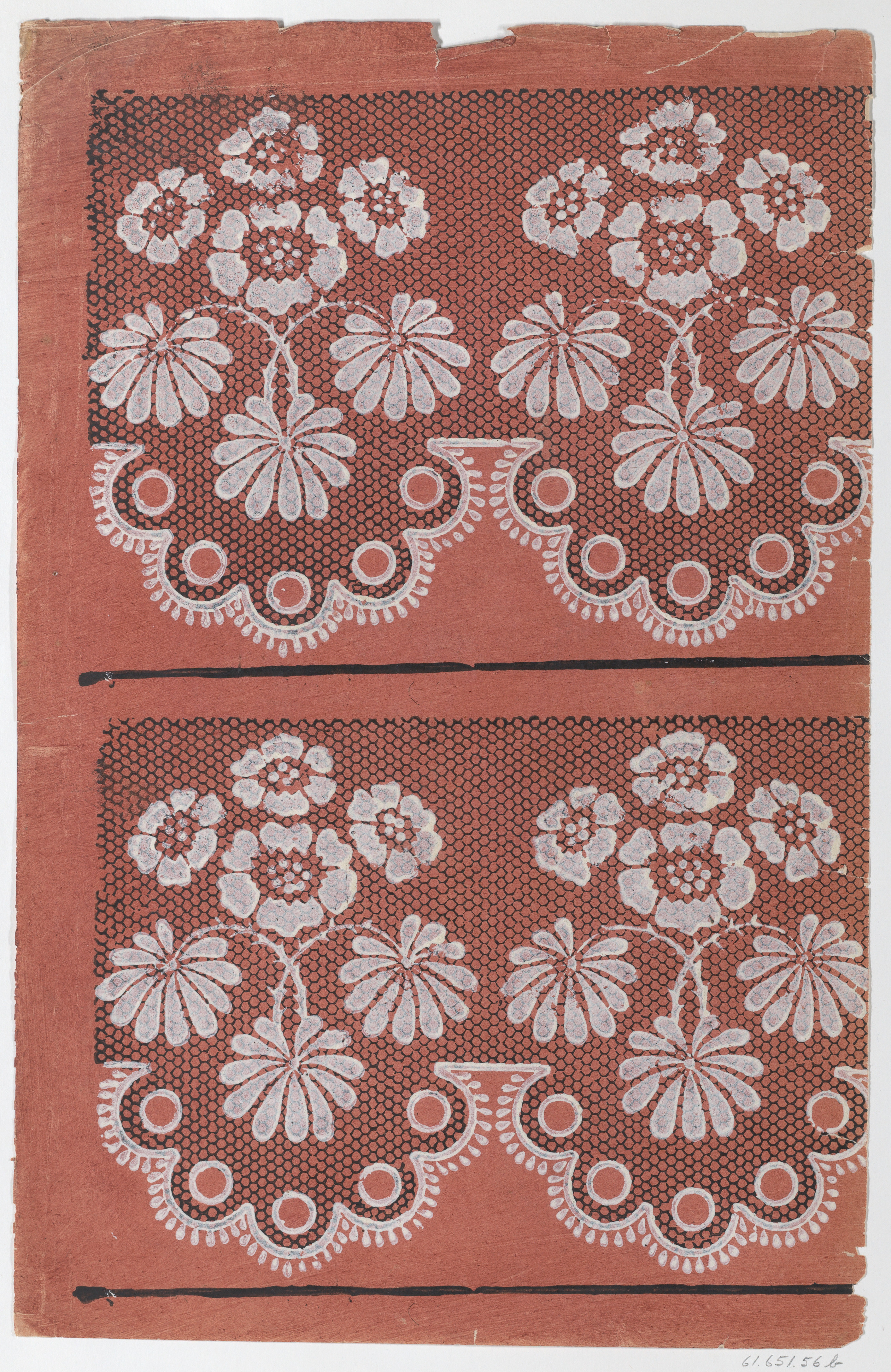
Deconstructing the Dichotomy: A Couture Analysis of the Red Sheet with Black Lace and White Floral Relief
In the ever-evolving lexicon of high fashion, the most compelling narratives often emerge from the tension between opposing forces. Katherine Fashion Lab’s standalone study—a red sheet bordered by a white floral pattern, set against a black lace motif, executed in relief print—presents a masterclass in this dialectic. This piece is not merely a textile; it is a philosophical inquiry into heritage, materiality, and the audacity of restraint. At first glance, it offers a visual paradox: the boldness of crimson against the austerity of black, the organic fluidity of florals against the geometric rigidity of lace, and the tactile depth of relief printing against the flatness of a two-dimensional ground. For the discerning couture analyst, this work demands a layered reading—one that traces its global roots, interrogates its technical execution, and situates it within the broader discourse of contemporary fashion as wearable art.
The Chromatic and Textural Dialogue
The foundational element of this study is the red sheet, a hue that carries immense cultural weight. In many global traditions—from the bridal lehenga of South Asia to the ceremonial hong of East Asia, and the power rouge of European aristocracy—red signifies life, transition, and authority. Yet Katherine Fashion Lab subverts this historical weight by pairing it with a black lace pattern. Black, often associated with mourning or modernity, here serves as a grounding counterpoint. The lace pattern, rendered not in thread but in relief print, introduces a trompe-l’œil effect: it mimics the airy intricacy of needlework while remaining a solid, printed surface. This deliberate tension between illusion and reality challenges the viewer’s perception of depth. The white floral pattern, positioned along the borders, acts as a mediator. White, the color of purity and blank possibility, lifts the composition from the gravity of red and black, offering a moment of visual respite. The florals themselves—likely inspired by motifs from Indian chintz, Ottoman kilim, or European toile de Jouy—are not mere decoration; they are signifiers of a shared global aesthetic that transcends geographical boundaries.
Materiality and the Relief Print Process
The decision to employ relief printing—whether from wood or metal—is the intellectual core of this study. In an era dominated by digital textile printing and mass production, the relief print reintroduces the hand of the artisan. Each impression carries the subtle imperfections of the carved matrix: the slight bleeding of ink at the edges, the uneven pressure that creates a varied saturation, the grain of the wood or the burr of the metal. These are not flaws; they are authentic markers of process. For Katherine Fashion Lab, this technique aligns with the Global Heritage context by honoring pre-industrial methods that are rapidly disappearing. Woodblock printing, historically practiced in Gujarat, India, and later adapted by European textile mills, represents a cross-continental lineage of craftsmanship. The metal relief, on the other hand, evokes the precision of intaglio printmaking, often used in courtly fabrics of the Ming dynasty or Renaissance Italy. By merging these two traditions—the organic warmth of wood and the sharp clarity of metal—the lab creates a hybrid surface that speaks to the fluidity of cultural exchange.
The relief process also alters the fabric’s tactile experience. Unlike screen printing, which sits on the surface, relief printing presses the pigment into the fibers, creating a slight raised texture. This haptic quality invites touch, transforming the garment from a purely visual object into a sensory one. In couture, where the body is the ultimate canvas, this textural dimension is paramount. The black lace pattern, when felt, reveals itself as a series of raised lines that mimic the loops and twists of actual lace, while the white florals offer a smoother, more opaque surface. This interplay of textures—rough against smooth, raised against flat—mirrors the complexity of global identity itself: layered, uneven, and deeply personal.
Standalone Study as a Conceptual Statement
Katherine Fashion Lab’s designation of this piece as a standalone study is a deliberate curatorial choice. In the context of haute couture, a “study” implies an investigation—a focused exploration of a singular idea without the constraints of a full collection. This frees the work from commercial expectations, allowing it to function as a pure artistic proposition. The red sheet with its dual borders becomes a manifesto: a declaration that heritage is not a static archive but a living, breathing dialogue. The black lace pattern, often associated with lingerie or mourning, is here stripped of its gendered or funereal connotations and recontextualized as a structural element. The white floral border, typically seen as romantic or pastoral, is rendered with the same graphic intensity as the lace, flattening the hierarchy between “foreground” and “background.” This is a radical act. It suggests that in the global heritage of fashion, no single motif or technique holds primacy; instead, meaning is generated through their juxtaposition.
Furthermore, the standalone format invites the viewer to consider the piece as a fragment of a larger narrative. Is this a swatch from a ceremonial robe? A panel from a forgotten tapestry? A prototype for a future collection? The ambiguity is intentional. By refusing to resolve these questions, Katherine Fashion Lab positions the study as a provocation—a call to reconsider how we assign value to textile artifacts. In a world saturated with fast fashion and visual noise, the relief print’s insistence on slowness and skill becomes a form of resistance. The red, black, and white palette, while visually striking, is also a study in chromatic discipline: three colors, infinite possibilities. This restraint echoes the principles of wabi-sabi and shibui, Japanese aesthetics that find beauty in imperfection and subtlety, while also nodding to the bold color blocking of African kente and Latin American arpilleras.
Implications for Contemporary Couture
As the fashion industry grapples with questions of cultural appropriation versus appreciation, Katherine Fashion Lab’s work offers a sophisticated model. The relief print is not a direct copy of any one tradition; it is a synthesis. The black lace pattern, while evocative of Spanish mantilla or French dentelle, is rendered through a technique that honors Indian and Chinese printmaking. The white floral border could be read as Mughal, Ottoman, or Victorian, yet the relief process gives it a modernist edge. This is not cultural borrowing; it is cultural translation. The lab acknowledges that in a globalized world, heritage is inherently hybrid. By foregrounding the relief print—a technique that requires skill, time, and material investment—the lab also critiques the disposability of contemporary fashion. Couture, at its best, is a slow art. This study embodies that slowness, inviting the wearer or viewer to pause, to touch, and to contemplate the layers of history embedded in every impression.
In conclusion, the red sheet with two borders—white floral atop black lace, executed in relief print—is far more than a textile sample. It is a microcosm of global heritage, a testament to the enduring power of handcraft, and a bold statement on the future of couture. Katherine Fashion Lab has succeeded in creating a work that is at once ancient and avant-garde, local and universal. For the collector, it is a treasure; for the scholar, a thesis; for the designer, an inspiration. In its quiet, disciplined beauty, it reminds us that the most profound fashion statements are often those that speak in whispers, not shouts.