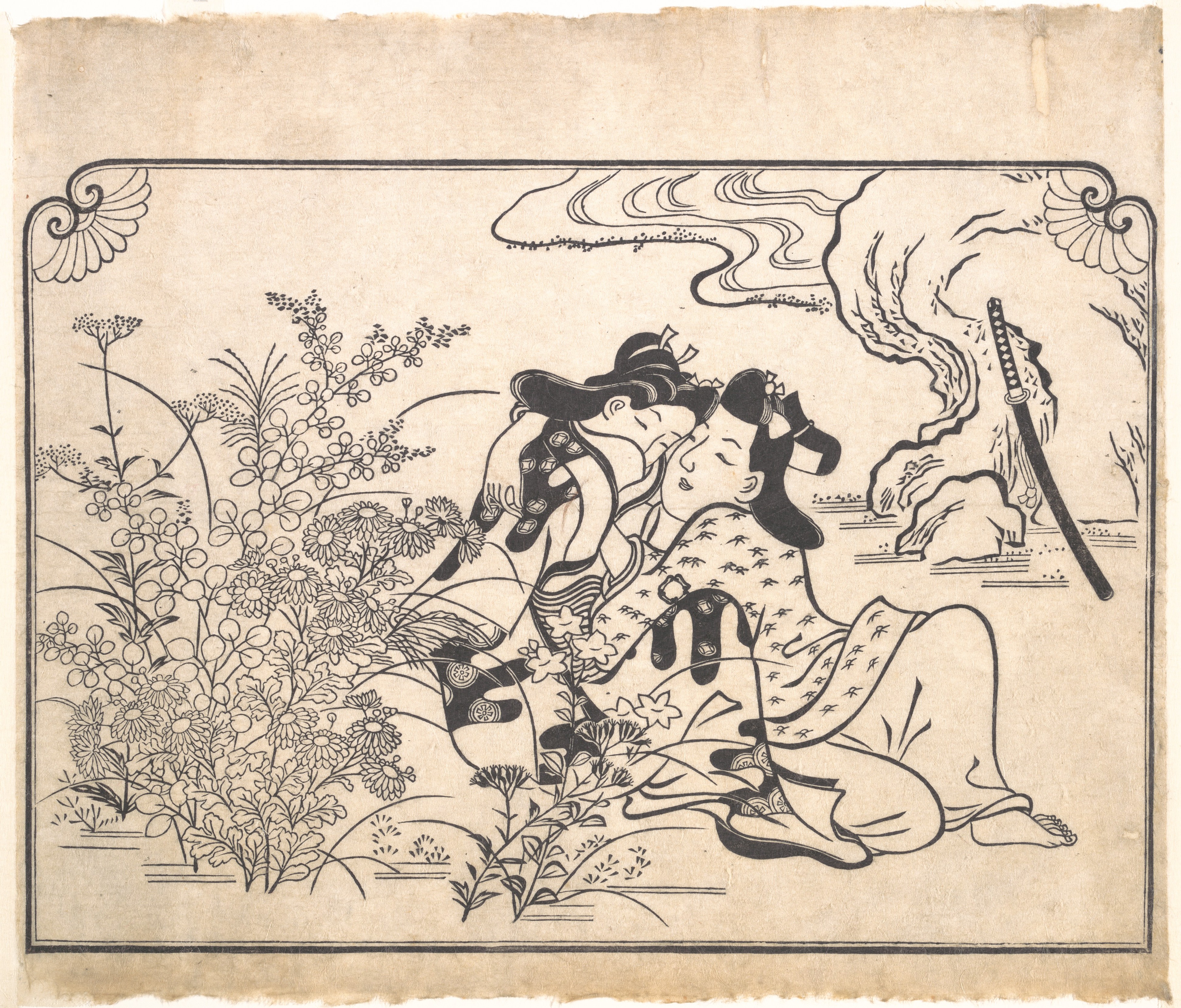
Lovers Beside Flowering Autumn Grasses: A Couture Analysis of Japanese Ukiyo-e Aesthetics
Introduction: The Convergence of Nature and Intimacy in Edo-Period Design
The woodblock print Lovers Beside Flowering Autumn Grasses, executed in ink on paper, represents a quintessential expression of Japan’s ukiyo-e tradition—a genre that flourished during the Edo period (1603–1868). This standalone study, attributed to an anonymous or lesser-known master of the floating world, captures a private moment between two figures enveloped by the transient beauty of autumn flora. As a couture analyst at Katherine Fashion Lab, I approach this work not merely as a visual artifact but as a sartorial lexicon of textures, silhouettes, and symbolic motifs that transcend time. The print’s composition, color palette, and narrative depth offer a blueprint for high-fashion collections that marry historical reverence with avant-garde innovation. In this analysis, I deconstruct the print’s elements to reveal how its aesthetic principles can inform contemporary luxury design, from fabric manipulation to thematic storytelling.
Composition and Visual Rhythm: The Architecture of Desire
The print’s layout is a masterclass in asymmetrical balance, a hallmark of Japanese design philosophy. The lovers occupy the lower left quadrant, their bodies intertwined in a gentle diagonal that contrasts with the vertical thrust of flowering autumn grasses—susuki (pampas grass), hagi (bush clover), and kiku (chrysanthemums)—which rise in rhythmic clusters across the upper and right portions of the image. This spatial tension creates a visual push-and-pull that mirrors the emotional gravity of the scene. For a couture collection, this translates into garment construction that plays with directional lines and layered volumes. Imagine a kimono-inspired coat with asymmetrical draping: the left side fitted and structured, the right flowing into cascading pleats that mimic the grasses’ organic sway. The lovers’ proximity suggests a shared warmth, which could be echoed in tactile fabrics like cashmere blends or silk charmeuse, their surfaces catching light to emulate the ink’s subtle gradations.
The use of negative space, or yohaku, is equally critical. The unprinted areas of the paper do not signify emptiness but rather a breathing room that amplifies the figures’ intimacy. In fashion, this concept can be realized through cutouts, sheer panels, or strategic draping that reveals skin or underlying textiles. A gown with a high neckline and a dramatic backless silhouette, for instance, would channel this philosophy: the fabric’s absence becomes a statement of presence, much like the ink’s restraint.
Color Palette and Materiality: From Ink to Textile
The print’s chromatic range is deliberately subdued, relying on the monochromatic depth of black ink (sumi) and the natural tone of washi paper. Yet within this limitation, the artist achieves remarkable nuance through varying ink densities—from pale washes to stark, concentrated lines. This technique, known as bokashi (gradation), offers a direct parallel to textile dyeing methods such as shibori or ombré. A couture interpretation might involve a hand-dyed silk organza dress that transitions from deep charcoal at the hem to translucent ivory at the shoulders, replicating the ink’s atmospheric fade. The grasses themselves, rendered with swift, calligraphic strokes, suggest a texture that could be imitated through embroidered raffia or metallic thread in a gradient of matte and sheen.
The lovers’ garments, though minimally detailed, hint at layered kimonos with overlapping collars (eri) and obi sashes. These elements inspire a modular design approach: a jacket with detachable sleeves or a skirt with adjustable waist ties, allowing the wearer to reconfigure the silhouette like a woodblock printer rearranging blocks. The absence of vivid color—no reds or golds—forces the viewer to focus on form and gesture, a lesson in restraint that high fashion often neglects. A capsule collection based on this print would prioritize neutral tones (charcoal, ivory, slate) punctuated by occasional bursts of deep indigo, echoing the ink’s tonal range.
Symbolic Motifs: The Language of Autumn Grasses
In Japanese iconography, autumn grasses are laden with meaning. Pampas grass (susuki) evokes the moon-viewing season and impermanence; bush clover (hagi) symbolizes elegance and resilience; chrysanthemums (kiku) represent longevity and rejuvenation. Together, they create a narrative of fleeting beauty—a metaphor for the lovers’ own ephemeral union. For a couture line, these motifs can be abstracted into embroidered patterns, laser-cut appliqués, or jacquard weaves. A floor-length cape might feature a repeating chrysanthemum motif in tonal silk thread, its petals unfurling like the print’s ink strokes. Alternatively, the grasses could be translated into structural elements: a bodice with boning that mimics the stalks’ verticality, or a skirt with tiers of organza that rustle like susuki in the wind.
The lovers’ poses—one figure leaning in, the other slightly turned—suggest a dialogue of bodies that can inspire garment closures and fastenings. Instead of conventional zippers, a dress might use asymmetrical knots, ribbon ties, or magnetic clasps hidden within folds, encouraging the wearer to interact with the piece as a ritual of dressing. This interactivity echoes the print’s intimacy: the clothing becomes a second skin that both reveals and conceals.
Couture Translation: A Collection Blueprint
Translating this ukiyo-e study into a modern collection requires a balance of fidelity and innovation. The first piece could be a tailored coat in double-faced wool, with the outer layer featuring a hand-painted ink gradient and the inner layer lined with a subtle grass-motif print. The second look might be a gown with a high, wrapped collar and a train that sweeps like autumn wind through foliage, its fabric a mix of matte crepe and glossy satin to emulate ink’s texture. Accessories would include obi-inspired belts with metalwork that echoes the print’s calligraphic lines, and footwear with wooden soles reminiscent of geta sandals, updated with modern ergonomics.
The collection’s narrative arc would unfold like a haiku: beginning with the lovers’ initial encounter (sharp, structured silhouettes), moving to their embrace (flowing, layered forms), and ending with the transient parting (asymmetrical hemlines and exposed seams). Each garment would carry a hidden detail—a secret pocket, a hand-stitched seam—that rewards close inspection, much like the print’s subtle ink washes.
Conclusion: The Eternal Relevance of Transient Beauty
Lovers Beside Flowering Autumn Grasses is more than a historical artifact; it is a philosophical treatise on the intersection of nature, humanity, and materiality. Its lesson for couture lies in the power of suggestion—the unspoken, the half-seen, the ephemeral. At Katherine Fashion Lab, we recognize that true luxury is not about excess but about intention: every line, every fold, every shade must serve a narrative. This print reminds us that the most profound beauty often resides in the quiet moments between bold strokes, where love and autumn grasses sway together in the fading light. By weaving these principles into fabric and form, we honor the past while forging a future where fashion is both art and memory.