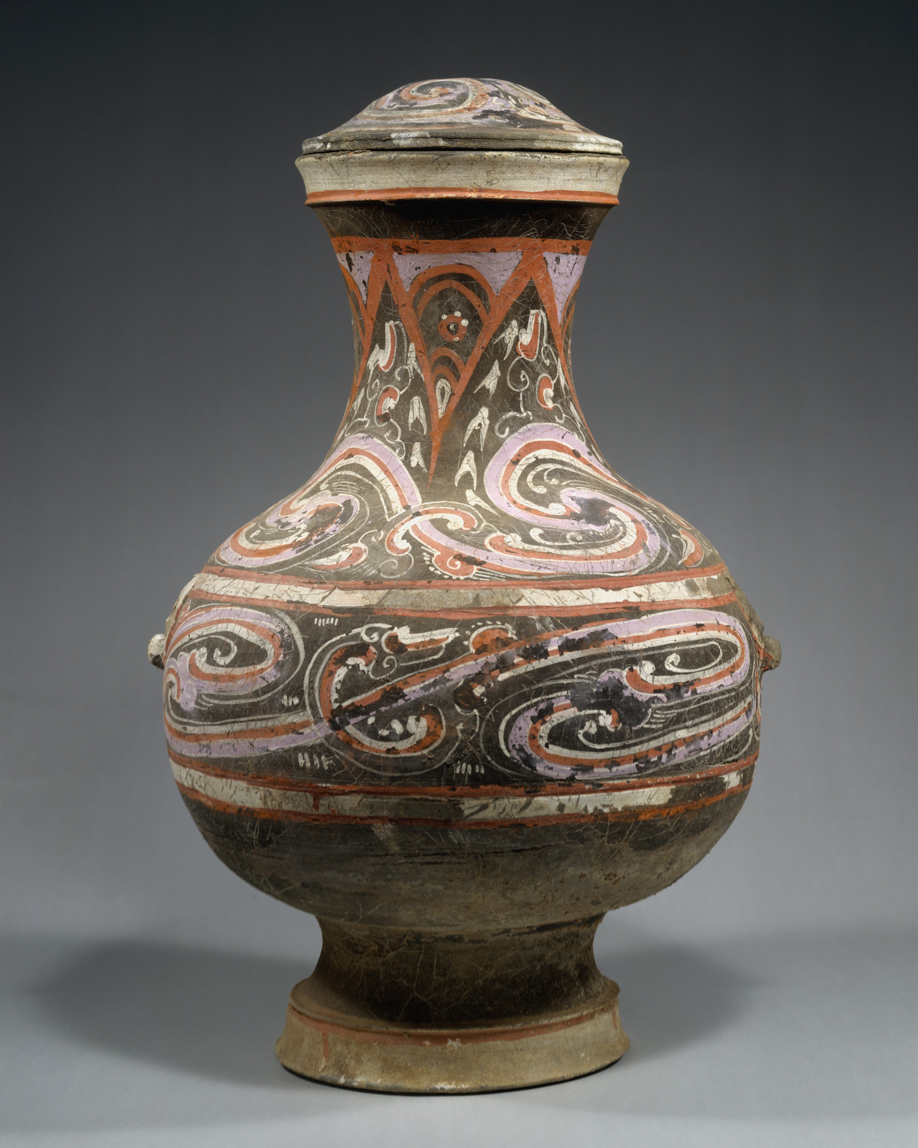
The Covered Jar (Hu): An Analysis of Form, Material, and Cultural Resonance
In the vast lexicon of ceramic art, few objects encapsulate the intersection of utility, ritual, and aesthetic ambition as profoundly as the Chinese Covered Jar, or Hu. At Katherine Fashion Lab, we approach this artifact not merely as a historical relic but as a masterclass in design principles that transcend time—a standalone study in how material, form, and decoration coalesce to create an object of enduring significance. This earthenware vessel, adorned with painted decoration, offers a compelling narrative of craftsmanship, cultural symbolism, and the subtle dialogue between function and beauty.
Historical and Cultural Context: The Hu as a Vessel of Meaning
The Hu form, originating in ancient China, is traditionally associated with storage—of grain, wine, or ritual offerings. Yet its evolution from a purely utilitarian object to a canvas for artistic expression reflects the sophisticated sociocultural dynamics of early Chinese dynasties. During periods such as the Han (206 BCE–220 CE) and Tang (618–907 CE) dynasties, covered jars were frequently interred in tombs as part of burial goods, believed to sustain the deceased in the afterlife. This funerary context imbues the Hu with a dual identity: it is both a tangible container and a metaphysical bridge between the mortal and the spiritual.
For Katherine Fashion Lab, the Hu serves as a foundational reference for exploring how objects can encode cultural memory. The covered lid, often shaped like a dome or a mythical creature, is not merely a protective element but a symbolic closure—a gesture of safeguarding what is precious, whether grain or spirit. This concept resonates deeply with contemporary design, where packaging and presentation are increasingly viewed as integral to the user’s emotional experience. The Hu reminds us that the act of covering is an act of reverence.
Materiality and Technique: Earthenware as a Medium of Expression
The choice of earthenware for this vessel is both pragmatic and poetic. Earthenware, fired at relatively low temperatures (typically below 1200°C), results in a porous, slightly soft body that is highly receptive to painted decoration. Unlike stoneware or porcelain, which demand higher vitrification, earthenware offers a tactile warmth and a matte finish that invites touch. This materiality aligns with the Hu’s intended role as a domestic or ritual object—one that should feel grounded and accessible, not cold or distant.
The painted decoration on this specific piece is executed with mineral-based pigments, likely derived from iron oxides, copper, or manganese, applied before firing. The technique, known as under-glaze painting in later periods, here appears as a direct application onto the bisque or leather-hard clay. The motifs—often swirling clouds, stylized animals, or geometric bands—are rendered with a fluid, calligraphic confidence. These designs are not mere embellishments; they are visual narratives. The cloud scrolls, for instance, evoke the Daoist concept of qi (vital energy), while animal motifs like the dragon or phoenix symbolize power and renewal. In the context of Katherine Fashion Lab, this integration of narrative and decoration challenges us to consider how surface treatment can elevate an object from the ordinary to the iconic.
Formal Analysis: The Architecture of the Covered Jar
From a structural perspective, the Hu exhibits a masterful balance of proportions. The body typically swells from a narrow base to a broad, rounded shoulder, then contracts slightly at the neck before flaring into a lip that accommodates the lid. This silhouette—often described as “pear-shaped” or “globular”—creates a sense of contained volume, suggesting abundance and stability. The foot ring, though modest, provides a visual anchor, grounding the vessel in space.
The lid is a critical component, both functionally and aesthetically. In this example, the lid is slightly domed, with a finial that may take the form of a simplified animal or a knob. The fit is precise, creating a seamless transition between body and cover. This attention to the closure mechanism reveals an advanced understanding of ceramics: the potter must account for shrinkage during drying and firing, ensuring that the lid remains functional without warping. For Katherine Fashion Lab, this precision echoes the importance of fit and finish in high-end fashion—where a seam, a zipper, or a clasp must perform flawlessly to maintain the integrity of the garment.
The painted decoration further enhances the form. Horizontal bands often delineate the neck, shoulder, and body, creating a rhythmic visual cadence that guides the eye around the vessel. The primary motif—perhaps a dragon chasing a flaming pearl—is placed on the broadest part of the body, where it can be fully appreciated. This strategic placement is a lesson in focal hierarchy: the designer directs attention to the area of greatest visual impact, while the neck and base remain subordinate. In fashion, this principle translates to the strategic placement of embroidery, beading, or print on a silhouette.
Symbolism and Semiotics: Reading the Painted Decoration
The iconography of the Hu is rich with layered meaning. The painted decoration on this piece likely includes motifs such as the taotie (a mythical beast mask), spirals, or cloud patterns, each carrying specific connotations. The taotie, common in Shang and Zhou dynasty bronzes, represents a protective, apotropaic force—warding off evil spirits. Its adaptation to earthenware suggests a democratization of ritual symbolism, where even humbler materials could carry profound significance.
Cloud patterns, meanwhile, are emblematic of transcendence and immortality. In Daoist cosmology, clouds are the vehicles of immortals, and their swirling forms evoke the constant flux of the universe. The repetition of these motifs creates a visual rhythm that mirrors the cyclical nature of life and death—a fitting theme for a funerary object. For Katherine Fashion Lab, this semiotic depth challenges us to think beyond the surface. Every pattern, every color choice in a collection can carry subtext, telling a story that resonates with the wearer’s identity or aspirations.
Comparative Context: Earthenware vs. High-Fired Ceramics
It is instructive to compare this earthenware Hu with its high-fired counterparts, such as stoneware or porcelain. While porcelain, with its luminous translucency and hardness, often commands higher market value, earthenware possesses a distinct aesthetic humility. The lower firing temperature allows for a broader palette of pigments, as many colors would burn out at stoneware temperatures. This gives earthenware a painterly quality—a directness of expression that feels more spontaneous and intimate.
In the context of Katherine Fashion Lab, this distinction parallels the difference between a structured, architectural gown (akin to porcelain) and a fluid, hand-painted silk dress (akin to earthenware). Both have their place in a well-curated wardrobe, but the earthenware Hu reminds us that material honesty—embracing the inherent qualities of clay, pigment, and fire—can produce objects of profound beauty without the need for technical virtuosity. It is a lesson in respecting the medium.
Conclusion: The Enduring Legacy of the Covered Jar
As a standalone study, the Covered Jar (Hu) offers a microcosm of Chinese ceramic art and a timeless template for design thinking. Its earthenware body speaks to the earth, its painted decoration to the heavens, and its covered form to the human need for preservation and ritual. At Katherine Fashion Lab, we draw inspiration from such artifacts to inform our own creative process—whether in the drape of a fabric, the closure of a garment, or the narrative woven into a pattern.
The Hu is not simply a jar; it is a statement on the relationship between container and contained, between the visible and the hidden, between the temporal and the eternal. In its humble clay and vibrant pigments, we find a blueprint for creating objects that are not only functional but also deeply, enduringly meaningful.