The Deep Green of Summer Mountains: A Couture Analysis
Contextualizing the Source: The Aesthetic of the Hanging Scroll
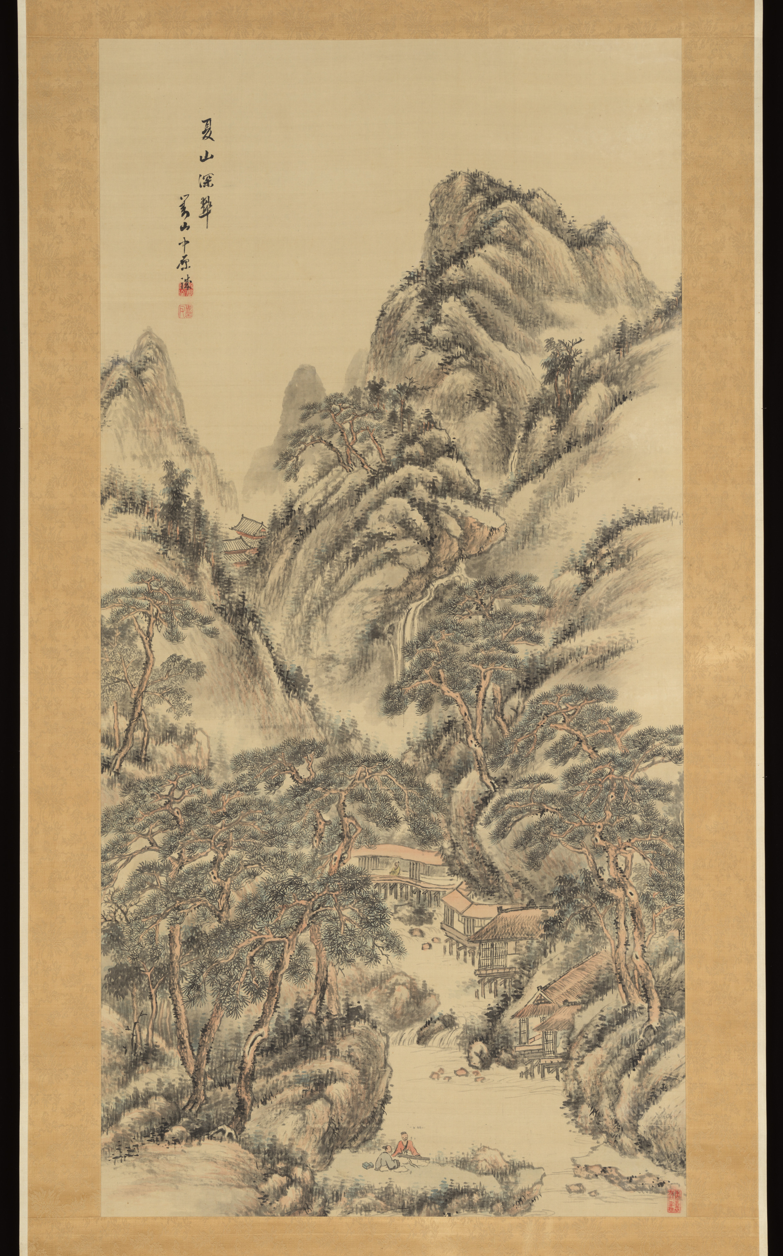
The subject of this couture analysis, “The Deep Green of Summer Mountains,” originates from Japan as a standalone study executed in ink and color on silk, presented as a hanging scroll. This medium is not merely decorative; it is a philosophical vessel. In traditional Japanese aesthetics, the hanging scroll (kakemono) is a transient object, displayed for specific seasons or occasions, embodying the concept of mono no aware—the poignant awareness of impermanence. For Katherine Fashion Lab, this piece serves as a profound departure from the ephemeral nature of fast fashion. Instead, it demands a couture translation that respects the scroll’s stillness, its verticality, and its meditative depth. The ink and color on silk technique, particularly the nuanced layering of mineral pigments (iwa-enogu) and sumi ink, creates a texture that is both matte and luminous, a quality that must be reimagined through fabric manipulation. The “standalone study” label indicates that this is not a panoramic landscape but a concentrated, intimate vision—a single moment of nature’s intensity, which in couture terms translates to a focused, almost architectural silhouette that captures the essence of a summer mountain’s dense, living green.
Color Palette and Pigment Philosophy
The title’s “Deep Green” is not a single hue but a spectrum of verdant intensities. In the original scroll, the artist would have used malachite green (rokushō), a vibrant, opaque mineral pigment, alongside organic indigo (ai) and yellow ochre to create shadows and highlights. Katherine Fashion Lab’s analysis must deconstruct this palette into a couture color story. The primary shade is a deep, resinous green reminiscent of moss-covered stone in a shaded forest. This is not the bright green of spring but the saturated, almost black-green of midsummer, when leaves are heavy with moisture and light filters through a dense canopy. Secondary tones include a muted jade for highlights, a charcoal-infused viridian for shadows, and occasional flashes of gold from the scroll’s silk backing, which suggests a sunset or a hidden temple roof. In fabric, this translates to silk velvet for the deepest greens (to capture the ink’s absorbency), hand-painted silk chiffon for the lighter jade layers (to mimic the translucency of color washes), and metallic thread embroidery for the gold accents. The challenge is to avoid flatness; each green must be layered and reactive to light, just as the ink and mineral pigments interact on silk over time.
Silhouette and Structural Translation
The hanging scroll’s vertical format—narrow and elongated—imposes a strict but elegant structural constraint. Katherine Fashion Lab’s design must honor this verticality without sacrificing wearability. The primary silhouette is a columnar gown with a high neckline and a train that unfurls like the scroll’s bottom edge. The bodice is structured to evoke the scroll’s mounting: a stiff, obi-like panel of deep green brocade wraps the torso, representing the wooden roller at the scroll’s base. From this panel, the fabric cascades in asymmetrical, water-like folds, mimicking the ink washes that depict mountain slopes. The sleeves, if present, are elongated and narrow, resembling the scroll’s side borders. Alternatively, a kimono-inspired jacket with a dramatic, floor-length back panel could serve as a standalone piece. The key is controlled fluidity: the garment must move like a scroll being unrolled, with each fold revealing a different shade of green. The hem is raw-edged, echoing the scroll’s unbound silk, and the train is weighted with small, hidden crystals to simulate the scroll’s weighted bottom rod.
Textile Innovation: Ink and Color on Fabric
Translating the “ink and color on silk” technique requires advanced textile manipulation. Katherine Fashion Lab would employ a combination of hand-painting, shibori, and digital printing to replicate the scroll’s brushwork. The deepest greens are achieved through a multi-step dye process: first, a base of black indigo, then a resist technique using rice paste to create the mountain contours, followed by hand-applied mineral pigment powders fixed with steam. The color layers are deliberately uneven, with some areas more saturated to mimic the artist’s brush pressure. For the ink effect, a technique called “sumi-nagashi” (ink floating on water) is adapted to fabric: silk panels are floated on a bath of diluted ink, allowing the carbon particles to settle in organic, cloud-like patterns. This creates a watercolor effect that is unique to each garment. Additionally, the “color” aspect—the subtle hints of ochre, vermilion, and gold—are embroidered using silk threads that are hand-dyed with natural pigments, ensuring that the fabric’s light reflection changes with movement, just as the scroll’s silk shifts in candlelight.
Narrative and Symbolic Elements
Beyond aesthetics, the scroll carries symbolic weight. Summer mountains in Japanese art often represent spiritual refuge and the cycle of life. The deep green is the color of vitality, growth, and the quiet power of nature. Katherine Fashion Lab’s couture piece must embed these symbols through subtle details. For instance, a hidden pocket inside the gown’s lining contains a small, embroidered mountain peak—a secret talisman for the wearer. The back of the garment features a faint, water-printed image of a winding mountain path, visible only in certain light, symbolizing life’s journey. The closure system uses frog buttons made from carved jade and silk cord, mimicking the scroll’s silk ties. Even the weight of the fabric is considered: the gown is heavier at the hem (to anchor the wearer, like the mountain’s roots) and lighter at the shoulders (to evoke the mountain’s misty peak). This narrative depth transforms the garment from clothing into a wearable meditation, aligning with Katherine Fashion Lab’s ethos of slow, meaningful design.
Conclusion: A Couture Ode to Impermanence
“The Deep Green of Summer Mountains” as a couture analysis is not about replicating a painting but about channeling its essence into a three-dimensional, tactile experience. Katherine Fashion Lab’s approach honors the Japanese concept of wabi-sabi—the beauty of imperfection and transience. The garment’s hand-painted unevenness, the raw edges, the subtle fading of color over time—all are features, not flaws. In a fashion industry obsessed with perfection and speed, this piece stands as a quiet rebellion. It asks the wearer to slow down, to observe the layers of green, to feel the weight of silk and the memory of a summer mountain. The final piece is not a costume but a companion, a scroll that unfurls with each step, carrying the stillness of ancient Japan into the modern world. This is couture as poetry, where every stitch is a brushstroke, and every fold is a line of ink on silk.