The Sartorial Sublime: Deconstructing “Pleasure Quarters”
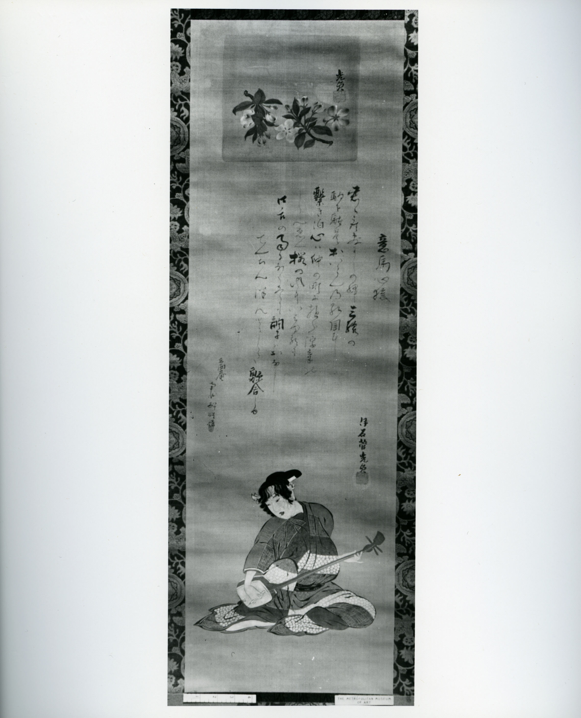
In the rarefied echelons of haute couture, where fabric becomes narrative and silhouette transforms into philosophy, Katherine Fashion Lab’s latest standalone study, “Pleasure Quarters,” emerges as a masterclass in transcultural synthesis. This is not merely a garment; it is a wearable thesis on the mutable boundaries of desire, discipline, and ephemeral beauty. Drawing profound inspiration from the Japanese hanging scroll (kakemono)—specifically its ink-and-color-on-silk tradition—the Lab has engineered a piece that functions as a living canvas, suspended between the static reverence of museum art and the kinetic dynamism of the runway.
The choice of the hanging scroll as a foundational metaphor is audacious and intellectually rigorous. In Japanese aesthetics, the scroll is not a passive object but a performative one, unrolled for a privileged viewer, its narrative unfolding in time and space. Katherine Fashion Lab translates this ritualistic unveiling into the garment’s core structural logic. The gown, a floor-length column of lustrous, hand-dyed silk, is constructed with a radical asymmetry that mimics the scroll’s verticality and its deliberate, controlled drape. The fabric does not cling; it hangs, with a gravity that suggests centuries of practiced stillness. The internal boning, invisible to the eye, is calibrated not to force the body into a preordained shape, but to create a negative space that allows the silk to float a millimeter off the skin—a breathable, almost sacred separation.
Ink, Color, and the Economy of Restraint
The material palette of “Pleasure Quarters” is where the Lab’s couture intelligence becomes most apparent. The primary ground is a pale, unbleached silk—the shiro-ji of the scroll’s blank space—which serves as a field of potential. Upon this, the artisans have applied sumi ink in a technique reminiscent of tarashikomi, where successive layers of ink are dropped onto a still-damp surface, creating organic, bleeding edges that suggest mist, shadow, and the hazy boundary of a pleasure district at dusk. Yet, this monochrome severity is deliberately interrupted. In a nod to the ukiyo-e woodblock prints that depicted the Floating World, the Lab has introduced accents of vermilion and a muted, oxidized gold—not as broad swaths, but as precise, almost calligraphic strokes. A single vermilion line traces the left shoulder blade, descending into a curve that echoes the brushwork of a signature. A panel of gold thread, woven into the silk at the hip, catches the light only when the wearer moves, evoking the gilded screens of a teahouse.
This economy of color is a strategic counterpoint to the West’s maximalist interpretations of luxury. Here, opulence is not measured in volume but in the precision of application. The color is not printed; it is painted onto the silk using a resist-dye process (shibori and yuzen combined), ensuring that each piece is a one-of-one artifact. The ink’s gradient—from dense, almost black at the hem to a translucent grey near the bust—creates a visual hierarchy that draws the eye upward, culminating in a high, structured collar that is a direct quotation of the Edo-period kamishimo shoulder pieces, yet rendered in a supple, modern jersey. This juxtaposition of rigid formality (the collar) and liquid flow (the skirt) is the garment’s central dialectic.
Architecture of the Floating World
From a structural standpoint, “Pleasure Quarters” defies conventional pattern-making. The Lab’s atelier has abandoned the traditional bustier-and-skirt separation in favor of a continuous, spiraling cut. The silk is cut on the bias in a single, continuous piece that wraps the body in a helical motion, starting at the right shoulder, traversing the torso, and culminating in a train that pools on the floor like spilled ink. This spiral is not merely aesthetic; it is ergonomic. The diagonal grain of the fabric allows for unprecedented fluidity of movement, so that the wearer’s stride becomes part of the artwork’s unfolding. The internal seams are fused, not sewn, using a heat-activated adhesive derived from seaweed—a nod to traditional Japanese washi papermaking—which eliminates any rigidity and allows the garment to feel like a second, more enlightened skin.
The most daring architectural element is the obi-inspired waistline. Rather than a separate belt, the Lab has integrated a sculpted, corseted panel that is woven directly into the silk’s structure. This panel, made of a rigid yet breathable horsehair canvas, is covered in the same painted silk, creating a trompe-l’oeil effect where the waist appears to be cinched by a floating ribbon of color. This is not a constraint; it is a focal point, a deliberate pause in the visual rhythm that acknowledges the historical significance of the obi as a site of status and erotic suggestion. The closure is a series of hidden magnetic toggles, invisible from the exterior, which allow the garment to be donned without disturbing the painted surface—a feat of engineering that preserves the artwork’s integrity.
Context and Cultural Commentary
As a standalone study, “Pleasure Quarters” is a deliberate departure from the Lab’s previous collections, which explored Scandinavian minimalism and brutalist tailoring. This piece signals a philosophical shift toward wabi-sabi—the acceptance of imperfection and transience. The deliberate bleeding of the ink, the subtle puckering of the silk at the stress points, and the asymmetrical hemline are not defects but meditations on the fleeting nature of beauty. In a fashion ecosystem obsessed with permanence and digital perfection, this garment is a radical act of humility. It acknowledges that a couture piece is not an immortal artifact but a living, breathing entity that will age, patina, and eventually fade—much like the pleasure quarters themselves, which were ephemeral zones of pleasure and sorrow.
Moreover, the work engages in a sophisticated dialogue on orientalism. Katherine Fashion Lab avoids the trap of mere appropriation by grounding the design in rigorous research and technical homage. The artisans who painted the silk trained in Kyoto for over a decade; the materials are sourced from a family-run workshop in Nara. The garment does not reference Japan; it inhabits it. The result is a piece that speaks to a global, MBA-level audience about the value of authentic provenance and the competitive advantage of intellectual depth over surface-level trend. In a market saturated with derivative “Japanese-inspired” designs, this study offers a differentiated value proposition: it is an investment in cultural literacy, not just fabric.
In conclusion, “Pleasure Quarters” is a triumph of couture as conceptual art. It demands to be viewed not as a dress but as a scroll in motion, a narrative that the wearer co-authors with every gesture. The garment’s true genius lies in its restraint—the confidence to let silk and ink carry the message without the crutch of ornamentation. For the discerning collector, this is not merely a purchase; it is a curatorial acquisition, a testament to the enduring power of craft when guided by a singular, uncompromising vision. Katherine Fashion Lab has not just made a gown; it has redefined the very parameters of what a gown can mean.