The Rapier: An Exercise in Structural Elegance and Material Dialectics
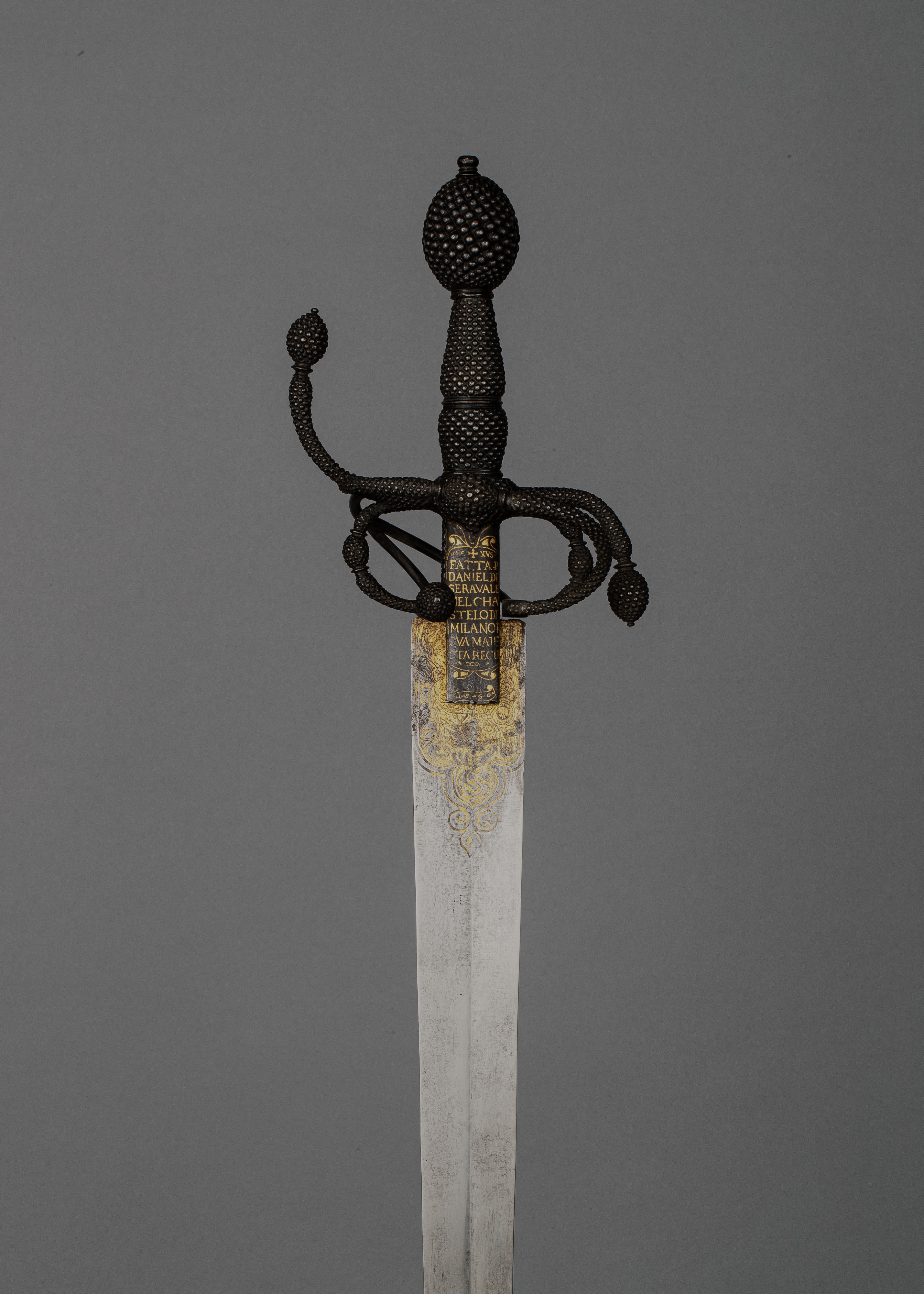
In the rarefied atmosphere of Katherine Fashion Lab's standalone study, the rapier transcends its martial origins to emerge as a profound object of couture analysis. Removed from the chaos of the duel or the pageantry of the court, this Milanese masterpiece—forged in steel, tempered with iron, and gilded with gold—demands to be read not as a weapon, but as a wearable sculpture. It is a testament to the proposition that true luxury lies not in ornamentation alone, but in the disciplined marriage of form, function, and material integrity. Here, we dissect the rapier as a singular artifact, examining its structural logic, its material grammar, and its silent, commanding presence within the curated silence of the atelier.
Deconstructing the Silhouette: The Blade as a Line of Intent
From a couture perspective, the rapier's silhouette is its primary gesture. Unlike the broad, assertive slash of a military saber, the rapier’s blade is an elongated, almost ethereal line—a study in verticality and restraint. In the language of haute couture, this is the equivalent of a razor-sharp pencil skirt or a precisely cut column gown: it does not shout; it insinuates. The blade’s length, typically exceeding forty inches, creates a visual rhythm that draws the eye upward, suggesting a posture of inherent nobility and controlled tension. The cross-section, whether diamond or hexagonal, is not merely a functional choice for rigidity; it is a play of light and shadow, creating a subtle, multifaceted gleam that shifts with the slightest movement. This is the couturier’s craft of architectural draping applied to metal—a deliberate manipulation of negative space and reflective planes to create a living, breathing line.
The point of the blade, sharpened to a needle-like precision, is the ultimate terminus of this line. In fashion terms, it is the sharpened lapel, the stiletto heel, the pointed toe—a final, decisive punctuation that communicates intent. It is not a passive end but an active promise, a vector of energy that completes the composition. The fuller, the central groove running along the blade, is often misread as mere weight reduction. In our analysis, it is a strategic seam, a channel that both lightens the structural load and adds a three-dimensional depth to the otherwise flat plane. It introduces a shadow line that breaks the monotony of the steel, offering a moment of visual respite and technical intrigue, much like a well-placed dart in a bodice that creates shape without compromising the fabric’s drape.
The Grammar of Materials: Steel, Iron, and Gold as a Textile Trio
The material composition of this rapier is a masterclass in textile hierarchy. Steel, the primary component, is the workhorse—the equivalent of a high-twist worsted wool or a resilient silk faille. It provides the tensile strength, the resilience, and the cool, unyielding surface that defines the piece’s character. The steel’s finish, likely a satin or a subtle mirror polish, is crucial. A high-polish would be brash, a matte finish would be somber. The chosen finish offers a refined luminosity, a quiet sheen that catches the eye without overwhelming the senses. This is the fabric’s hand—the tactile and visual sensation that invites closer inspection.
Iron, the second element, is the hidden infrastructure. Often present in the core or the guard, it is the unseen boning, the internal corsetry that gives the piece its rigidity and balance. It is the unsung hero of structural integrity. While steel provides the visible face, iron ensures the piece can withstand the stresses of use—or in our context, the stress of being observed. This duality is essential to the couture ethos: the visible perfection must be underpinned by invisible strength. The iron’s presence is a reminder that true elegance is never fragile; it is a product of rigorous engineering and hidden support.
Then comes gold, the disruptive, transcendent element. Applied not as a heavy plating but as delicate inlay, gilding, or wirework on the hilt and guard, the gold is the couture embroidery—the intricate beadwork, the metallic thread, the hand-applied sequin that elevates the piece from mere object to objet d’art. The gold is not merely decorative; it is a strategic accent that draws the eye to the points of interaction—the hand, the guard, the pommel. It creates a focal point, a moment of visual climax. The contrast between the cool, austere steel and the warm, opulent gold is a study in dialectical tension: strength versus beauty, utility versus ornament, the masculine versus the feminine. This is not a conflict but a synthesis, a harmonious balance that is the hallmark of the highest form of design.
The Hilt and Guard: The Couture Neckline and Sleeve
If the blade is the body of the garment, the hilt and guard are its neckline and sleeves—the areas of highest visual and tactile engagement. The guard, or quillons, extends outward in a graceful, sweeping curve. In our analysis, this is the architectural shoulder, the structured cap sleeve that frames the hand and creates a powerful, confident silhouette. The complexity of the guard’s form—often featuring rings, loops, and counter-guards—speaks to the maker’s virtuosity. It is the equivalent of a complex sleeve construction, with multiple panels, godets, and seams that allow for both movement and form. The gold inlay here is most pronounced, transforming the guard into a piece of jewelry, a statement collar that commands attention.
The grip, typically wrapped in wire or leather, is the tactile interface. In couture terms, it is the lining of the garment—the part that touches the skin, that must feel as exquisite as it looks. The wrapping pattern, whether a precise spiral or a complex basket weave, is a textural counterpoint to the smooth steel. It introduces a rhythmic, tactile element that breaks the visual monotony. The pommel, the counterweight at the end, is the final button, the closing clasp. It is the last note in the composition, often faceted or shaped to mirror the guard’s motifs, providing a sense of closure and balance. It ensures the entire piece hangs correctly, a perfect equilibrium of weight and form.
Standalone Study: The Object in Isolation
Presented in a standalone study, the rapier loses its functional context and gains a new, more potent one: pure aesthetic contemplation. It is no longer a tool for combat but a monument to human ingenuity and aesthetic ambition. The absence of a wielder allows us to appreciate the object’s inherent qualities—its balance, its proportion, its material dialogue—without distraction. It becomes a still life, a portrait of an era’s values. The rapier’s slender form speaks to a culture that prized wit, precision, and elegance over brute force. It is a symbol of the Renaissance courtier, a figure for whom style was a form of power.
For Katherine Fashion Lab, this study is a reminder that couture is not limited to fabric. It is a philosophy of creation, a discipline of thought that can be applied to any medium. The rapier’s construction—its careful selection of materials, its meticulous attention to line and proportion, its balance of strength and delicacy—mirrors the principles that govern our own atelier. It teaches us that true luxury is not about excess but about precision, intention, and the seamless integration of form and function. The gold is not an afterthought; it is a deliberate, calculated choice. The iron is not a compromise; it is a necessity. The steel is not a cold surface; it is a canvas.
In its silent, solitary presence, this Milanese rapier offers a masterclass in restraint and power. It is a piece that does not need to move to be dynamic, that does not need to speak to be heard. It stands as a testament to the enduring truth that the most profound statements are often made with the finest lines, the most disciplined structures, and the most deliberate use of precious materials. It is, in every sense, a couture object of the highest order.