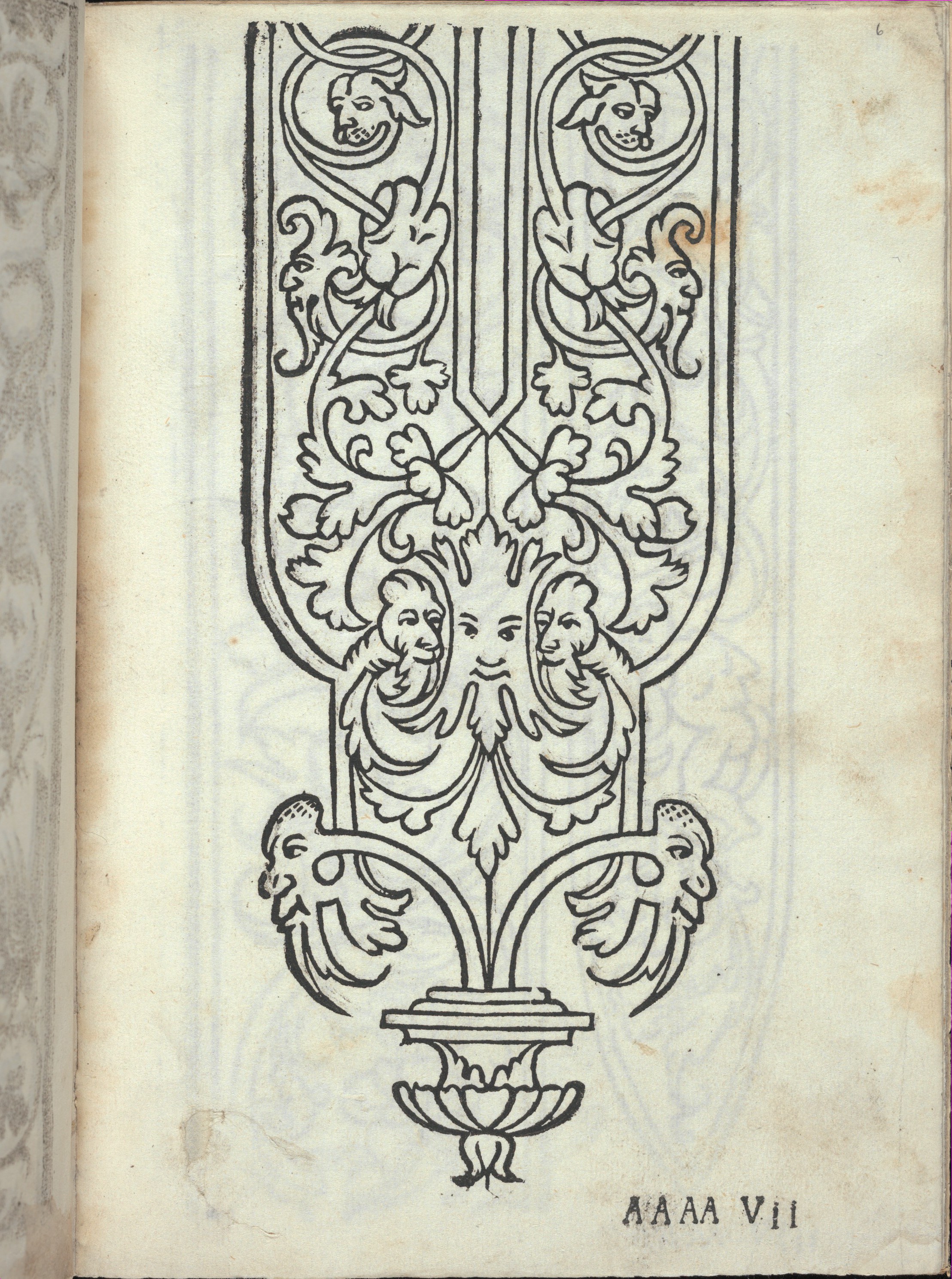
The Geometry of Prestige: A Couture Analysis of Libro Quarto, Page 6 Recto
In the rarefied echelons of fashion history, the printed pattern book stands as a silent, yet formidable, architect of style. Before the atelier, before the grand maisons of Paris, there was the woodcut—a humble block of carved wood that disseminated the grammar of ornament across Renaissance Europe. Katherine Fashion Lab’s current study of Libro quarto. De rechami per elquale se impara in diuersi modi lordine e il modo de recamare...Opera noua, specifically page 6 (recto), offers a profound opportunity to deconstruct the very DNA of haute couture. This is not merely a historical artifact; it is a masterclass in the foundational principles of structure, rhythm, and material logic that continue to underpin contemporary luxury design.
Deconstructing the Recto: A Study in Structural Discipline
The recto page of this 16th-century Venetian manual—a standalone study within the Global Heritage collection—presents a paradox of simplicity and complexity. At first glance, the woodcut appears as a stark, monochromatic grid of lines and motifs. Yet, a couture-level analysis reveals that this page is a rigorous exercise in negative space and repetitive symmetry. The woodcut medium, with its inherent inability to render fine gradients, forces a distillation of form to its absolute essentials. Every line is a deliberate declaration; every empty field is a calculated silence. This is the earliest form of “technical drawing” in the fashion canon, a precursor to the flat pattern sketch that defines modern garment construction.
The page’s composition is governed by a binary logic: the relationship between the embroidered stitch and the unworked ground. In contemporary couture, this translates to the dialogue between the embroidered panel and the sheer fabric, or the beaded motif against a matte silk base. The recto does not present a complete garment; it presents a system. This system—of modular motifs capable of infinite repetition—is the very essence of couture scalability. A single corner ornament, when repeated along a hem or a neckline, transforms from a singular detail into a commanding architectural statement. Page 6 recto teaches us that luxury is not found in chaos, but in the disciplined orchestration of a single, perfected unit.
The Materiality of the Mark: From Woodcut to Haute Broderie
To appreciate the couture implications of this page, one must first understand the material constraints of its origin. The woodcut, carved from a single block of pear or cherry wood, imposes a linearity that mimics the tension of the embroidery thread. The resulting print is a translation of a tactile, three-dimensional craft into a two-dimensional, reproducible blueprint. For the modern fashion analyst, this is the ultimate lesson in material translation. The designer must understand how a line drawn on paper will behave when rendered in silk thread, gold bullion, or sequins. The recto’s stark lines are not limitations; they are invitations for the embroiderer to interpret weight, sheen, and relief.
Analyzing the specific motifs on page 6 reveals a lexicon of Renaissance opulence. We observe the pomegranate—a symbol of fertility and wealth—rendered in a stylized, almost geometric form. There are also traces of the candeliere (candelabra) motif, a vertical axis of symmetry that would later evolve into the central panel of a Baroque gown. The woodcut’s reliance on hatching—parallel lines used to suggest shadow—is particularly telling. In couture, this translates to the use of ombre stitching, where the density of the thread creates a gradient effect. The page is, therefore, not merely a set of instructions; it is a manual on light manipulation. The embroiderer is taught to use the thread as a painter uses pigment, building up layers of tone through the density of the stitch.
The Grammar of Ornament: A Couture Vocabulary
The significance of Libro quarto extends beyond its technical content. It represents a pivotal moment in the democratization of style. Prior to the proliferation of such pattern books, embroidery patterns were closely guarded secrets within guilds and aristocratic households. The publication of this “Opera noua” (new work) effectively created a shared visual vocabulary across Europe. For the couture house, this translates to the concept of the brand code. Just as the recto page offers a repeatable motif that can be adapted for a sleeve, a bodice, or a train, a modern maison uses its signature pattern—be it a quilting diamond or a specific floral—as a unifying element across ready-to-wear and haute couture lines.
Furthermore, the page’s grid-like organization is a precursor to the modern mise en carte, the graph paper on which bead and sequin placements are plotted. This is the technical bridge between artistic vision and industrial precision. The recto’s insistence on order—on the perfect alignment of each motif—is a direct ancestor of the precisão required in contemporary ateliers, where a single misaligned sequin can compromise an entire garment’s integrity. The woodcut, with its carved, unyielding lines, demands a level of exactitude that is the hallmark of true luxury. It is the antithesis of the imprecise, the hand-drawn, the “wabi-sabi” aesthetic. This is a purely Euclidean approach to beauty—a beauty found in the perfect intersection of lines and the absolute consistency of form.
Contemporary Relevance: The Neo-Renaissance Silhouette
How does a 16th-century woodcut inform the collections of Katherine Fashion Lab today? The answer lies in the architectural silhouette. The motifs on page 6 recto, when scaled and applied to modern garment construction, suggest a return to structured rigidity. We see the potential for a sculptural bustier, its surface entirely encrusted with a modern interpretation of the pomegranate motif, rendered in jet black beads against a nude mesh. The vertical candeliere pattern could become a dramatic center-front seam, elongating the figure and creating a columnar, almost priestly, elegance.
Moreover, the page’s monochromatic nature speaks to a contemporary trend towards tonal dressing. The woodcut’s black-and-white clarity is a study in the power of a single hue. In a couture context, this might manifest as an entire gown in varying shades of off-white, where the only contrast comes from the texture of the embroidery—a matte thread against a satin ground, or a raised bullion stitch against a flat crepe. The recto page is a reminder that true luxury does not require a riot of color; it thrives on the subtle interplay of light, shadow, and surface relief. It is a philosophy of restrained excess—the use of immense labor and material to create an effect that appears, at first glance, almost simple.
Conclusion: The Immutable Code of Couture
In conclusion, page 6 (recto) of Libro quarto is far more than a historical curiosity. It is a foundational text in the canon of Western fashion, a document that codifies the principles of repetition, symmetry, and material discipline that define haute couture. The woodcut’s stark lines are a testament to the power of the designer’s hand, a hand that must translate a two-dimensional vision into a three-dimensional reality of thread and fabric. For Katherine Fashion Lab, this standalone study serves as a profound source of inspiration, a reminder that the most avant-garde creations are often rooted in the most ancient of grammars. The geometry of prestige is not a modern invention; it was carved in wood centuries ago, and its echoes still resonate in every perfectly placed stitch of a contemporary masterpiece. The recto is not a page; it is a blueprint for eternity.